See details of post Local SEO: 7 Google My Business questions asked and answered below
 Consumers are increasingly searching online for shops, grocery stores, restaurants, car dealers, realtors and other businesses in their local area. Not surprisingly, four out of five people use search engines to find local information, like a company’s business hours, address, phone number, online reviews, busy times and more, according to Google.
Google research also shows that businesses with detailed, complete, up-to-date online business listings are twice as likely to be considered reputable by consumers. (If you’ve ever looked up a local business online and driven all the way across town to their location only to find that they’ve moved, you know how frustrating that can be. When that happens, do you blame Google? Nope. You blame the business. And you’ve just lost trust in the business.)
Getting a local business listed on Google My Business (GMB) and other online directories is one of the fastest and easiest ways to get a local business to start showing up for local search results on Google. Google My Business connects businesses directly with their customers — whether they’re searching on Google Search or Maps.
Most SEOs who work with local clients consider claiming their GMB listing a first step in their SEO strategy. Surprisingly, 56 percent of local businesses haven’t claimed their Google My Business listing, according to Local Business Institute.
SEOs have a lot of questions about Google My Business
At the outset, Google My Business looks pretty straightforward. You fill in the company’s information, claim and verify the listing, add information about the company, post a few images and you’re good, right? Well, not so fast. Depending on the client, their business type and their listing, GMB can get complex. Here are seven common questions about Google My Business:
Q. I’ve heard people in the search industry talk about “Google Top Contributors.” What is a Google Top Contributor, and what is their relationship with Google?
A. A Google Top Contributor is a digital marketing professional who knows the ins and outs of Google products. These Top Contributors volunteer their time to respond to questions on Google Product Forums. (Yes, there’s even a specific forum for Google My Business.) The Google Product Forums allow people to interact with a community of other users to help answer Google product questions.
If you’re interested in becoming a Top Contributor, you want to be on the forums as much as possible, answering questions and engaging in the conversations. Google is constantly watching who’s saying what and tracking everything that goes on in the various product forums.
To get started, search the forums for questions and answer the questions you have knowledge and expertise on. Once you start answering questions, you’re eligible to join the Top Contributor Program and become a “Rising Star” (the first stage to becoming a Top Contributor.) Google is on the lookout for people who are helpful and show off their product knowledge — and have a willingness to help others.
Why would anyone want to spend a lot of their personal time answering questions on a forum? Well, there are perks that go along with being a Google Top Contributor. First, you often get better access to Google itself. This means that people can contact you directly about an issue they’re having, and you can escalate it to your contacts at Google. You could also become part of beta programs, be invited to groups and Google meetings, become a Google thought leader and more. It takes a lot of time to answer questions, but if you want to be a pro in the Google world, becoming a Google Top Contributor is the way to go!
Q. I’m setting up my client’s GMB account. To do this, I’m creating a separate Gmail email address to claim their listing. Is this the right way to do it?
A. First, it’s always best if the client claims their GMB page and then makes you a manager of the page. You can then log in and optimize their Google My Business listing:

If the client doesn’t feel comfortable claiming their listing, keep a few things in mind before you jump in on their behalf:
- Make sure you get express permission from them to claim their Google My Business listing on their behalf.
- Don’t create a Gmail email address for the setup of GMB. Instead, use the client’s domain email address as the primary email address (e.g., info@companyname.com) and add yourself as a manager of the listing. This way the client gets all communications and will always maintain control of their listing — but you will also be kept in the loop as a manager.
- Additionally, don’t use your personal cell phone or your agency’s number when setting up a client’s GMB account — always use the business owner’s or business’s phone number. Why? What would happen if you left your agency or the client decides to switch agencies? It may be very difficult for the client to get control of their listing. Using the business’s phone number keeps the business owner in complete control of their listing, and it will also prevent your phone number from being flagged by Google as being used too much.
Q. I have a restaurant as a client, and they’ve recently updated their menu. We noticed that there’s an outdated menu on their Google My Business Page. How did it get there, and how can I fix this?
A. Chances are, the menu information was scraped from a site called singleplatform.com. Single Platform is a site that helps restaurants and other service businesses show their menus and service listings consistently across many platforms (including Google.) Think of them as the “Yext” for menus.
To remove the Single Platform menu link from your client’s Google My Business listing, the business owner will need to contact Single Platform and request it be removed. The business listing owner should then contact Google My Business support and request it be removed.
Q. A former employee verified my client’s Google My Business listing, and we don’t know what email address they used. What should I do?
A. This is actually a common problem. Many businesses have a Google My Business listing that’s already been verified by either an employee, an agency or the owner, but they’ve forgotten which email address they used. Now that employee or agency is gone, and the business owner doesn’t know how to get access to their GMB listing.
Since the Google My Business listing is “owned” by the person who verified the listing, it’s important for the owner to get back control of their listing.
First, confirm that the business is listed on Google My Business:
- Go to Google My Business.
- Sign in with the Google account you think may have been used to claim/login to your business listing.
- Search for the business name and address.
- If the business appears in the search results, click on the listing.
- If you see a dialog that says that someone else has verified the business, select one of these options:
Try a different email address
If you’re like most people, you probably have more than one email address. You might have verified your business using one of your other email addresses. Try signing out, and then sign back in with one of your other Google accounts.
You will see any listings that have been verified with this Google account. If you still don’t see the business listing in any of the owner’s Google accounts, then you will need to contact the current listing owner.
Request access from the current listing owner
Google allows you to contact the current listing owner directly through Google My Business so you can request access to own or manage the business listing.
To request access from the current listing owner:
- Go to Google My Business.
- Sign in with the Google account you want to use to manage the business.
- Enter the name or address of the business and select it from the search results.
(Note: You might see a dialog that shows part of the email address that was used to verify the listing. The business owner might recognize that email address snippet. If the owner recognizes the email address, sign into that account to access the business listing.)
- Fill out the form with your contact information. The current listing owner might need to contact you, so you need to share your contact details with them.
- Click Submit.
- The current listing owner will get an email asking them to reach out to you and you’ll receive a confirmation email. Click on the link in the email to check the status of your request.
- Allow seven days for the current listing owner to respond to your request. If you don’t hear back from them after seven days, you can then go in and verify your affiliation with the business to get access to the business listing.
Q. There are fake reviews about my business on my Google My Business listing. Can I get them removed?
A. Google encourages businesses to ask for reviews from customers (unlike Yelp). It’s inevitable that at some point you will get a bad review from unhappy customers or people that have had a negative experience with your company. Getting these reviews removed is very difficult (freedom of speech).
If there’s a review that you feel violates Google’s review policies, you can mark the flag next to the review.

However, typically, flagging the reviews will not get the review taken down unless the review blatantly violated Google’s review terms. Google allows anyone who has an “experience” with a business to leave a review. That means ex-employees, vendors, customers, postal carriers — just about anybody who has contact with your business can leave a positive or negative review about your company.
Since it’s not Google’s position to play “review cop,” it’s better to just try to get more positive reviews from happy customers so the negative/bogus review gets pushed down.
Q. How do you contact Google My Business Support? I’ve tried to find a way to contact them and am getting really frustrated!
A. There are several ways to reach out to Google My Business Support — but they don’t make it easy to find out how! Here are a couple of ways to reach GMB support:


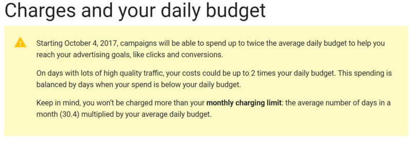
 On Wednesday afternoon, Google AdWords notified advertisers in their accounts and on Twitter that a change had already happened to the way budgets get handled on a daily basis. It is not going over well.