Google announces AdWords daily budgets can overspend by 2x, automatically

See details of post Google announces AdWords daily budgets can overspend by 2x, automatically below

On Wednesday afternoon, Google AdWords notified advertisers in their accounts and on Twitter that a change had already happened to the way budgets get handled on a daily basis. It is not going over well.

In the tweet, Google announced, “To help you hit your advertising goals, your campaigns can now spend up to twice your average daily budget.”

Say what?

The link leads to the broader notice that the change took effect Wednesday, and is not optional.

What gets lost in the tweet, which reads like something from The Onion, is that that advertisers “won’t be charged more than your monthly charging limit: the average number of days in a month (30.4) multiplied by your average daily budget.” That is obviously key. To reiterate: advertisers will not be charged for any overages above the expected monthly budget that come from this change.

The concept behind this change actually makes a lot of sense: that campaigns will be better equipped to account for lulls and spikes in daily activity. And, this is something Google has long been doing, just at a much lower increment. Before this update, campaigns could spend 20 percent more than the daily budget on a given day, but overall wouldn’t exceed the calculated monthly budget.

Why oh why does AdWords only have daily budgets?

The real question to me isn’t about the loss of control in yet one more area of campaign management, but why is daily still the only budgeting option? Why, particularly with this change forced on advertisers, isn’t there an option to set a monthly budget or a budget for the duration of the campaign if it has a fixed run time? That’s how budgets get allocated, and that’s how managers are expected to operate. Daily bid adjustments don’t address this issue. And usually the reason daily budgets get adjusted — resetting Google’s monthly charging limit — is because advertisers see that campaigns are under or over performing.

At the end of the month, advertisers want to have had the opportunity to get as many qualified clicks and conversions as possible within their given budget. A daily budget is really just a limitation advertisers are forced into by having to allocate a monthly budget evenly throughout the 30-day period. But Google’s change here — that daily spend could exceed the budget by “up to 2 times” — is also arbitrary. What if it turns out there are a handful of days when it would benefit the advertiser to triple the daily budget, knowing there are days that will spend a fraction of the daily limit?

Ideally, if Sunday was a particularly slow day and my campaign only spent $200 of the $300 budgeted, I’d want the system to automatically roll over the unspent $100 to be available Monday and allow the campaign to spend up to $400 that day. That’s not quite what’s happening here. How can advertisers know that their campaigns aren’t being throttled after multiple days of heavy overspending, for example?

Overdelivery credits

With overdelivery credits, maybe it doesn’t matter. “Sometimes we deliver over your monthly budget. In those cases, we’ll credit the overdelivery cost back,” says Google. This is the measure that should help advertisers feel a bit better about the change. Advertisers can see overdelivery by day from the Reports section in AdWords.

Google clarifies on this page that it considers monthly budgets to be calendar month budgets and not a rolling 30.4 day period. That’s good. The over delivery credits will show up in an advertiser’s transaction history once they are processed and show up on the invoice once a month.

see more here

This Elastic Glue Can Seal Wounds In Under 60 Seconds

check out this post on This Elastic Glue Can Seal Wounds In Under 60 Seconds

A highly-elastic glue could be the future of treating wounds inflicted in car accidents or war zones, after it was shown to successfully seal open incisions in less than one minute.

The “potentially life-saving” MeTro gel, which is just administered directly to the site of the injury by squirting it from a syringe, could transform the way surgery is performed by negating the need for common staples and sutures.

Professor Anthony Weiss said: “The potential applications are powerful.”

Elastagen Pty Ltd

A team of biomedical engineers, from the University of Sydney, developed the adhesive substance, which is similar to silicone sealants used around bathroom and kitchen tiles, according to Professor Weiss.

Once applied to the area, it is treated with UV light and sets within 60 seconds.

It is also at this stage that it can be treated with a built-in degrading enzyme that can be modified to determine how long it lasts (between hours and months) before disintegrating. Unlike stitches that would have often required removal.

Once it has degraded, there is no signs of toxicity left in the body.

Elastagen Pty Ltd

So far it has been most useful for sealing wounds in body tissues that continually expand and relax, such as lungs, heart and arteries, that are otherwise at risk of re-opening with classic methods of stitching.

It also works on internal wounds that are often in hard-to-reach areas and have typically required staples or sutures due to surrounding body fluid hampering the effectiveness of other sealants.

Elastagen Pty Ltd

check out original

Programming Note: Offline For Sukkot

i wish you like this article on Programming Note: Offline For Sukkot

I will be offline completely for the holiday of Sukkot/Succos on October 5th and October 6th and the following week, October 12th and October 13th. Any stories published here will be scheduled and written beforehand and not posted live.

link to main source

This Elastic Glue Can Seal Wounds In Under 60 Seconds

check out this post on This Elastic Glue Can Seal Wounds In Under 60 Seconds

A highly-elastic glue could be the future of treating wounds inflicted in car accidents or war zones, after it was shown to successfully seal open incisions in less than one minute.

The “potentially life-saving” MeTro gel, which is just administered directly to the site of the injury by squirting it from a syringe, could transform the way surgery is performed by negating the need for common staples and sutures.

Professor Anthony Weiss said: “The potential applications are powerful.”

Elastagen Pty Ltd

A team of biomedical engineers, from the University of Sydney, developed the adhesive substance, which is similar to silicone sealants used around bathroom and kitchen tiles, according to Professor Weiss.

Once applied to the area, it is treated with UV light and sets within 60 seconds.

It is also at this stage that it can be treated with a built-in degrading enzyme that can be modified to determine how long it lasts (between hours and months) before disintegrating. Unlike stitches that would have often required removal.

Once it has degraded, there is no signs of toxicity left in the body.

Elastagen Pty Ltd

So far it has been most useful for sealing wounds in body tissues that continually expand and relax, such as lungs, heart and arteries, that are otherwise at risk of re-opening with classic methods of stitching.

It also works on internal wounds that are often in hard-to-reach areas and have typically required staples or sutures due to surrounding body fluid hampering the effectiveness of other sealants.

Elastagen Pty Ltd

check out original

Visually understanding your site structure and external link weight impact

See details of post Visually understanding your site structure and external link weight impact below

They say a picture is worth a thousand words — and wow, are they correct!

Today, I’m going to illustrate powerful ways to visualize your site structure, specifically as it relates to pages that acquire incoming links; however, we’ll also discuss other applications of this technique using analytics metrics or other third-party data.

There are a number of reasons you would want to do this, among them to provide a visual context to data. As we will see below, visual representations of data can assist in quickly identifying patterns in site structures that may not be evident when viewed as a spreadsheet or as raw data. You can also use these visuals to explain to clients and other stakeholders what’s going on in a site structure.

To build a visual representation of our site structure as it relates to incoming links, we will be:

  • running Screaming Frog to gather internal page data and link structure.
  • adding the number of backlinks each page has to the page’s metrics.
  • using Gephi to create a visual representation of this data.

For those unfamiliar with Gephi, it’s an open-source data visualization tool — basically, it turns data into an interactive picture.

Getting your core data

Regardless of whether you want to visualize your site structure relative to your site traffic or another metric, the process is essentially the same. So, let’s begin by…

Collecting your internal link structure

The first step is to download Screaming Frog if you don’t already have it installed. For sites under 500 URLs, the free version will suffice; those with larger sites may want to purchase the premium version, though they can still use the free version to get some rough ideas of what their site structure is doing.

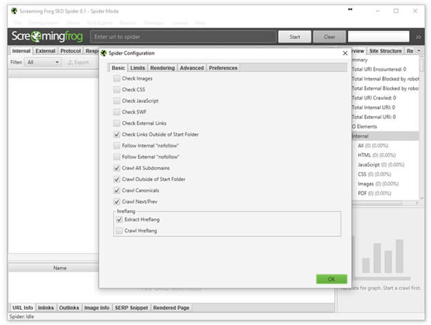
Now, use Screaming Frog to crawl the site you want to map. You don’t need to collect the images, CSS, JavaScript and so on, so the spider configuration should look like the screen shot below. (However, you will want to make your own decisions about whether you want to crawl subdomains and so on, based on your needs and site structure.)

Screaming Frog

Enter the domain  you want to check and click “Start.” Once the crawl is completed, it’s time to export the data and clean it up a bit. To do this, simply go to:

Bulk Export > Response Codes > Success (2xx) Inlinks

Once downloaded, open the file and do the following:

  • Delete the first row containing “All Inlinks.”
  • Delete the first column, “Type.”
  • Rename the “Destination” column “Target.”
  • Delete all other columns besides “Source” and “Target.”
  • Save the edited file. You can name it whatever you’d like, but I will be referring to mine throughout the article as working.csv.

Clean up Screaming Frog data in Excel

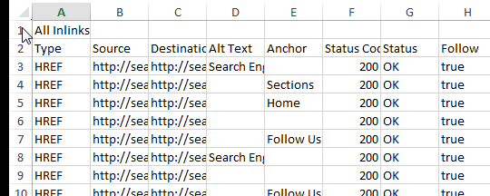
I highly recommend scanning through your Source and Target columns to look for anomalies. For example, the site I crawled for the screen shots below contained anchor links on a large number of pages. I did a quick search for the hashtag in the Target column and deleted those so they didn’t skew my link flow information.

With this, we are left with a spreadsheet that should look something like this:

This data alone can be pretty cool to analyze — and to that end, I recommend reading Patrick Stox’s article, “Easy visualizations of PageRank and Page Groups with Gephi.”

In his article, Stox used Gephi to visualize the relationships between pages on a website and to see which pages are the strongest (based on the site’s internal link graph).

Gephi Modularity

You can read his article for directions and a description, but in short, what we’re seeing is different “clusters” of pages (based on which pages link together most often — not perfect but not bad), grouped by color and sized by internal links (with the most linked-to pages appearing larger).

This information is handy, to be sure. But what if we want more? What if we want to truly color the pages based on their site section, and what if we want them sized by the number of inbound external links?

To achieve this, you’ll first need to download your top linked pages from Google Search Console. If you haven’t done that before, you simply log in to your Search Console account and do the following:

  • Click “Search Traffic” in the left nav.
  • Click “Links to Your Site” in the menu that opens.
  • Click “More >>” under the column “Your most linked content.”
  • And “Download this table.”

The only problem with the data as it’s downloaded is that for our purposes, we need the URLs in the form of a domain, and the table only displays the path.  To deal with this easily, you can simply:

  • Open the spreadsheet.
  • Insert a new column A before the URL path.
  • Put your domain https://www.yourdomain.com/ in cell A3 (assuming B2 contains your domain which oddly is the only URL to display fully) so that you don’t create https://www.yourdomain.com/https://www.yourdomain.com/.
  • Double-click the bottom-right corner of the cell with your recently added domain to copy the domain to the bottom of the spreadsheet.
  • Select the data from columns A and B (the domain and the path) and copy it to Notepad.
  • Find and Replace “/ /” with “/” (excluding quotes).
  • Select all in the Notepad.
  • Past that into column B and delete column A.
  • Now you have the same list but with the full URL.

Getting the data into Gephi

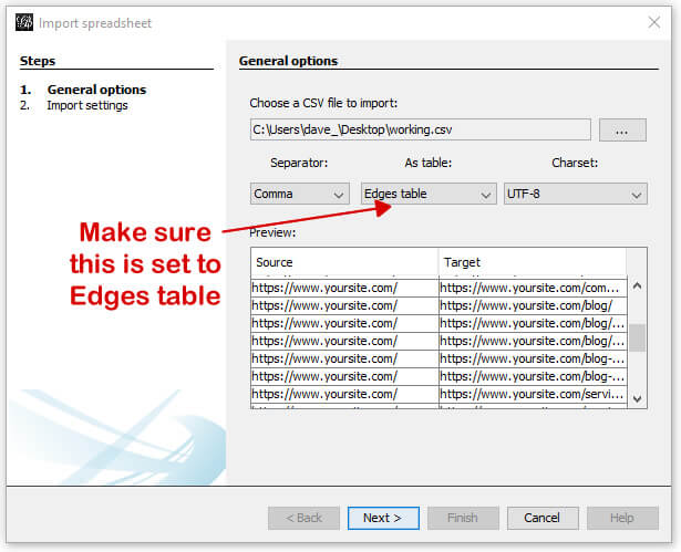
Here, we’ll be uploading the Source/Target CSV file we created earlier and named working.csv. This will create the edges and nodes Gephi needs to create the graphs. (For our purposes here, a node is a page, and an edge represents the link between pages.) To import the spreadsheet, simply open Gephi and go to: File > Import spreadsheet.

A new window will open where you will select your working.csv file and select “Edges table” (since we’re importing the connections between the pages). It will look like:

Import edges into Gephi

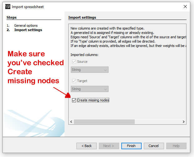
In the next screen, you’ll be shown a couple of options (very limited in this example). Simply make sure the “Create missing nodes” box is checked, and click next.

Import edges into Gephi

Assuming it opens to the Overview tab (which it should on first use), you’ll be presented with something that looks like:

Gephi imported

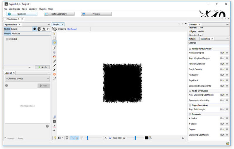
A bit messy, and we’re not going to clean it up yet. First, we’re going to head over to the Data Laboratory and export the Nodes (read: pages).

Gephi Data Laboratory

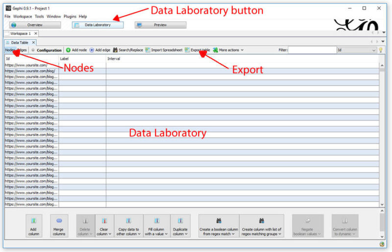
Once in the Data Laboratory, make sure you’re looking at the Nodes by clicking the Nodes button near the top left. Once there, simply export the table so you have a csv of all your nodes.

When you open the csv, it should have the following columns:

  • Id
  • Label
  • Timeset

You’ll add a fourth column named after whichever metric you want to pull in. Here, I’m going to pull in the referring domains as reported in the Search Console, so I will label the fourth column (D) “referring domains.” The fifth will be “modularity_class.”

You’ll want to temporarily add a second sheet to the spreadsheet and name it “search console.”

In cell D2 (right below the column D heading), enter the following formula:

=IFERROR(INDEX(‘search console’!$C$2:$C$136,MATCH(A2,’search console’!$A$2:$A$136,0),1),”0″)

In my example here, there are 136 rows in my Search Console data. Yours may differ, in which case the 136 in the formula above should be changed to the number of rows in your list. Additionally, if you wanted to list your link counts and not referring domains, you would change the Cs to Bs so the search is across column B instead of C.

Once completed, you will want to copy the referring domains column and use the “Paste Values” command, which will switch the cells from containing a formula to containing the value of their number of referring domains as an integer.

The process looks like:

Add referring domains to nodes

Now, finally, you want to add a fifth column with the heading “modularity_class.” Although Gephi has modularity built in, which will cluster similar pages together based on the internal link structure, I prefer a more manual approach that clearly defines the page’s category.

In my example, I’m going to assign one of the following values to each page in the modularity_class column, based on the page category:

  • 0 – misc/other
  • 1 – blog posts
  • 2 – resource pages
  • 3 – company info
  • 4 – service
  • 5 – homepage

How you break your categories out will, of course, depend on your site (e.g., you might break up your e-commerce site by product type, or your travel site by location).

Once you’ve saved this as a csv named nodes.csv, you simply need to import this spreadsheet into the current Gelphi project using the Import Spreadsheet button on the Data Laboratory screen you exported from.

Import nodes to Gephi

On the next screen, you’ll make sure “referring domains” and “modularity_class” are set to Float and make sure the “Force nodes to be created as new ones” box is unchecked. Then click “Next.” Once imported, you’ll be looking at a page like:

DAta laboratory import complete

You’ll then click back to the Overview at the top of Gephi. At this point, you’ll notice that not a lot has changed… but it’s about to.

There’s a ton you can do with Gephi. I recommend running the PageRank simulation, which you’ll find in the Settings on the right-hand side. The default settings work well. Now it’s time to use all this data.

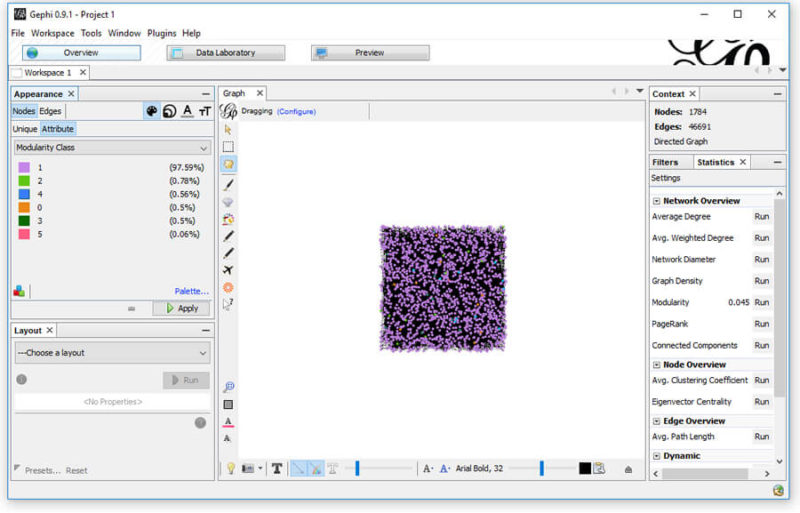
First, we’ll color the nodes based on their page type (modularity_class). In the top left, select “Nodes,” then “Attribute.” From the drop-down, select “Modularity Class” and choose which color you’d like representing each. From my example above, I’ve opted for the following colors:

  • misc/other — orange
  • blog posts — light purple
  • resource pages — light green
  • company info — dark green
  • service — blue
  • homepage — pink

This will give you something close to:

Color modularity in Gephi

Now, let’s use those referring domains to size the Nodes. This time, we need to select to size the attribute “referring domains.” To do this, select the sizing icon; then, in the Attributes, select “referring domains” and set a min and max sizing. I like to start with 10 and 50, but each graph is unique, so find what works for you.

If you find that “referring domains” is not in the list (which happens sometimes), it’s an odd glitch with an equally odd workaround — and credit to rbsam on Github for it:

On Appearence/Attributes by color you can set the attribute to Partitioning to Ranking on the bottom left of the window. If the attribute is set to Partitioning it will not appear on Size attribute. If it is set to Ranking it will appear on Size attribute.

What this means is…

Add referring domains workaround

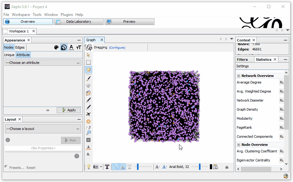
All right, so now we’ve got things color-coded by the various sections of the site and sized by the level of incoming links to the page. It still looks a bit confusing, but we’re not done yet!

The next step is to select a layout in the bottom left. They all look a bit different and serve different functions. My favorite two are Fruchterman Reingold (shown below) and Force Atlas 2. You can also toy around with the gravity (that is, how much the edges pull the nodes together). The current site appears as:

Just this information can give you a very interesting view of what’s going on in your site. What’s important to know is that when you right-click on any node, you can opt to select it in the data laboratory. Want to know what that lone page up at the top is and why it’s only got one lonely link to it? Right-click and view it in the data laboratory (it’s a sitemap, FYI). You can also do the same in reverse. If you don’t see an individual page appearing, you can find it in the data laboratory and right-click it and select it in the overview.

What this visualization gives us is an ability to quickly locate anomalies in the site, figure out which pages are grouped in specific ways, and find opportunities to improve the flow of PageRank and internal link weight.

And you’re not this limited

In this article, we’ve only looked at one application, but there are numerous others — we simply need to use our imaginations.

Why not pull your Moz Page Authority or Google Analytics incoming organic traffic and use that as the sizing metric to view which sections of your site get the most traffic and help spot problems in your internal linking structure?

view the original article here

Bing Ads rolling out Dynamic Search Ads to US and UK

See details of post Bing Ads rolling out Dynamic Search Ads to US and UK below

Advertisers in the US and UK can now run Dynamic Search Ads (DSA) in the Bing Ads platform. DSA support is available in the platform’s online interface today, and it will roll out to Bing Ads Editor throughout October.

How DSA works

DSA is an automated way of allowing Bing to serve ads to searchers without an advertiser having to specify certain keywords or landing pages to target. Bing’s organic crawling algorithm assesses content and then matches it to user queries based on what it perceives to be relevant to the searcher, driving them to the relevant URL.

This process is further automated by Bing dynamically generating the ad headline the searcher sees. When possible, it will include copy to address any real-time signals that might be useful, such as intent or location.

DSA is frequently helpful to search marketers due to its ability to find new search terms automatically that may be worthwhile to add to the account. It can also be particularly beneficial in situations like an e-commerce site with hundreds of SKUs or model numbers, saving advertisers from having to bid on every single instance of a model or product ID.

How to set up a DSA campaign

Pre-existing DSA campaigns in AdWords can be imported directly to save time. Setting up new ones takes just a few steps.

As with other new campaigns, a budget and name are specified, with an additional field for the website that traffic will be driven to:

Next, an advertiser specifies what sections of the website should be crawled. Advertisers can choose to have the whole site crawled, just specific pages, or specific categories of web pages. (Note: Category options are continually being updated, so accounts may have limited or no options yet.)

Advertisers can specify multiple ad targets using these options and set default bids separately as appropriate for their goals. In this example, an advertiser has opted to use the default $1.00 bid that’s set at the ad group level, with separate bids for URLs containing “clearance” and another for instances where the page title includes “special packages.”

view the original article here

Humans First Left Africa Because Of Climate Change

check out this post on Humans First Left Africa Because Of Climate Change

We know that humans first started to migrate our of Africa around 60,000 years ago, what we’ve never been entirely sure of is what caused the to do it.

New research led by a geoscientists from the University of Arizona has found however that the reason touches on a subject hat’s very much in the news now: Climate change.

Using the world’s most important collection of sediment cores from the deep sea the researchers were, incredibly, able to actually determine the temperature and climate from 60,000 years ago.

Previous research has suggested that when humans moved into Eurasia around 40,000-70,000 years ago north Africa needed to be wetter than it is now. What they found was very different.

raisbeckfoto via Getty Images

Using the sediment samples the team found that Africa had undergone a major transformation. Its previously fertile ‘Green Sahara’ had started to dry out, in fact at around the time humanity started to leave the Sahara was even drier than it is now, and a lot colder.

“Our data say the migration comes after a big environmental change. Perhaps people left because the environment was deteriorating,” explains Jessica Tierney, UA associate professor of geosciences.

“There was a big shift to dry and that could have been a motivating force for migration.”

What’s almost as impressive as their discovery is how they discovered it in the first place.

To create a long-term temperature record for the Horn of Africa the team analysed 4-inch segments of the sediment core with each section accounting for around 1,600 years.

LAMONT-DOHERTY EARTH OBSERVATORY

They then analysed the layers for chemicals called alkenones which are made by a very specific type of marine algae. As the temperature changes, so too does the composition of the chemicals being made by the algae, effectively allowing the team to take a temperature reading from 60,000 years later.

To figure out the rainfall the team did something equally as impressive.

gilaxia via Getty Images

They analysed the leaf wax that had blown into the ocean. Plants alter the chemical composition of their leaf wax depending on how wet or dry the climate is. By looking at the composition of the wax from that precise period in time they could tell exactly how wet or dry it was.

see original

Wanted: Session ideas for SMX West

See details of post Wanted: Session ideas for SMX West below

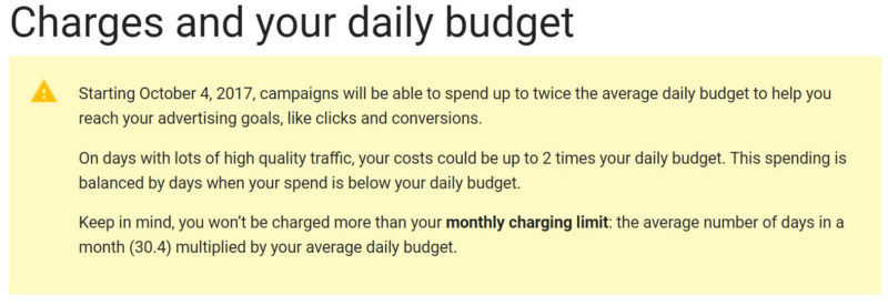
We want your input to help us plan our upcoming SMX West conference, which will be taking place on March 13-15, 2018. Specifically, we’d love to hear from you if you have an great idea for a session that you think should be on the agenda. And if you’re interested in speaking at the show, the absolute best way to improve your chances of being chosen is to get involved at this point, by suggesting an awesome idea that really catches our attention.

We’re looking for two types of suggestions:

Session ideas for regular SMX sessions. Most sessions at SMX conferences are 60-90 minutes in length, and feature 2 to 3 speakers. Here, we’re not looking for solo presentations; rather, your idea should be a topic where multiple speakers can each weigh in with their own point of view, opinion and suggested tactics. You can let us know if you’re interested in speaking or would just like to see the session idea considered without nominating yourself to speak.

Session ideas for solo presentations. Solo presentations are keynote level, Ted-style presentations from industry visionaries. We’re looking for the best of the best: seasoned professionals, acknowledged thought leaders, inspiring communicators. People who will wow attendees with their insights and motivate them to chart new territory in their own online marketing campaigns. If you pitch to speak on a solo session, you really need to wow us to be seriously considered. Solo sessions are typically 22 minutes long.

New: Focus On Online Retail Track

view the original article here

Google Testing Mobile First Index In The Wild

i wish you like this post on Google Testing Mobile First Index In The Wild

Google’s John Mueller confirmed yesterday in a hangout at the 15:38 mark that Google is indeed testing the mobile first index in the live search results. He did not explain what percentage of searchers are seeing these live test results but I have to imagine it is really small. With this test, Google is not only looking to see how much it impacts the searchers and current rankings but they are also building new classifiers for debugging purposes.

John explained that these internal classifiers are designed to label which sites have equivalent desktop to mobile pages and which do not. This way they can see if there are any common problems they are noticing across the live web where they can communicate to webmasters what changes they need to make. These forms of communication can be done via blog posts, direct communication from Google, Search Console messages and other means.

John Mueller would not give a date on the release but he did say they are testing things.

link to original source

Nobel Prize In Chemistry 2017 Awarded For Imaging The Molecules Of Life

check out this post on Nobel Prize In Chemistry 2017 Awarded For Imaging The Molecules Of Life

The Nobel Prize in Chemistry 2017 has been awarded to three researchers, Jacques Dubochet, Joachim Frank & Richard Henderson, for their work on imaging the molecules of life.

The three, including Cambridge University’s Richard Henderson, were able to develop a revolutionary new electron microscopy imaging technique that can see these molecules at the atomic level.

“This method has moved biochemistry into a new era,” the Royal Swedish Academy of Sciences said in a statement awarding the $1.1 million) prize.

“Researchers can now freeze biomolecules mid-movement and visualize processes they have never previously seen, which is decisive for both the basic understanding of life’s chemistry and for the development of pharmaceuticals.”

The breakthrough has been compared to being able to actually photograph a person on the Moon from Earth in minute detail.

Traditionally one of the biggest hurdles in using electron microscopes is that the water surrounding these molecules simply evaporates in the vacuum chamber.

check out original