check out this post on New Amazon Echo Speaker Unveiled With Late October UK Release Date
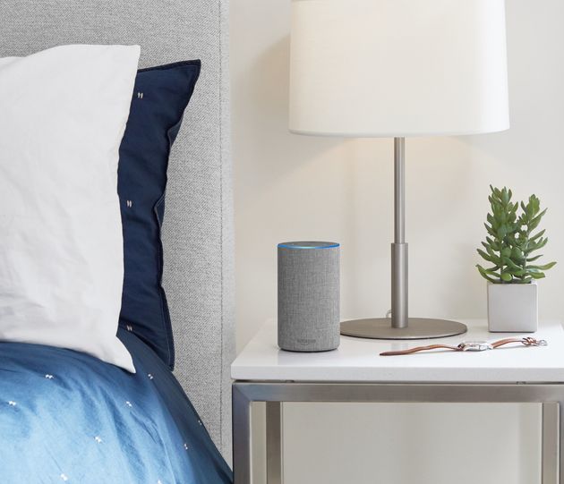
Amazon has unveiled not one, but three brand-new Echo devices at a special event held at its HQ in Seattle.
The three new gadgets are the new Amazon Echo now at a lower price, the Smart home-controlling Echo Plus and a small quirky Echo Spot which contains a small circular display.
Leading the event is the brand-new Amazon Echo. This sequel to the popular voice-activated speaker now comes with a new design, improved audio and a cheaper price.

Amazon
According to Amazon the new Echo boasts improved sound quality over the original with sound processing by Dolby. It also comes with Amazon’s second generation far-field microphone technology which should make it even easier to talk to in big or noisy rooms.
Then of course there’s the design. Amazon’s taken a leaf out of Google’s book and like the Google Home, now offers the Echo with a range of different covers.
Amazon
It costs £89.99, is available to order now and will be released in the UK on the 31 October 2017.
Next up is the Echo Plus. This features the same design as the original Echo but comes with two major improvements.

Amazon
Firstly, it now has the same audio improvements as the Echo including both a dedicated tweeter and woofer and audio processing by Dolby.
The second feature is arguably the more exciting. Echo Plus is actually a smart home hub, which means that it is compatible with hundreds of smart home products straight out of the box.
You simply tell Echo Plus to discover what’s in your house and it will search for, and then connect to everything that’s compatible without you having to go through each individual product.
For the added convenience and slightly bigger audio Amazon’s charging £139.99 for the Echo Plus and it too will release in the UK on the 31 October.
Last but not least is the Echo Spot. This doesn’t have a UK release date but it’s sure to be a hit in the US.

Amazon
It’s essentially a tiny version of Amazon’s larger Show speaker, with a small circular display that can show information, requests. It also has a camera that means it can double as a nursery camera.
Finally Amazon announced that the Echo Show would be launching in the UK on the 16 November for £199.99.

Amazon
New: Bulk Cancel Inactive Google AdWords Account
i hope you like this post on New: Bulk Cancel Inactive Google AdWords Account

You can now cancel in bulk your inactive Google AdWords accounts from your manager account. All you need to do is login, select them and click edit and then cancel.
- Sign in to your AdWords manager account.
- From the page menu on the left, click Accounts, then click Management along the top.
- Check the box next to the accounts you want to cancel.
- Click Edit and select Cancel from the drop-down.
SearchCap: Google bugs, Bing Ads conversions & Google local finder mentions
See details of post SearchCap: Google bugs, Bing Ads conversions & Google local finder mentions below

Below is what happened in search today, as reported on Search Engine Land and from other places across the web.
From Search Engine Land:
- Bing Ads announces new Editor features for ad extensions
Sep 28, 2017 by Susan WenogradNow available: Support for scheduling and Shared Libraries for call and location extensions
- Canonical tags gone wild
Sep 28, 2017 by Patrick StoxWhat happens when canonical tags get out of control and how can you rein them in? Columnist Patrick Stox shares his findings and insights.
- Bug drops Sitelinks Searchbox from Google search results
Sep 28, 2017 by Barry SchwartzGoogle is working on fixing a bug that has removed the internal site search box that typically appears with some search results snippets.
- Bing Ads rolling out offline conversion imports to capture impact of ads on offline sales
Sep 28, 2017 by Ginny MarvinAdvertisers can upload offline conversion data from their CRMs into Bing Ads.
- 7 on-site SEO problems that hold back e-commerce sites
Sep 28, 2017 by Pratik DholakiyaIs your e-commerce site experiencing weak organic traffic? Columnist Pratik Dholakiya shares some common issues that impact SEO for online retailers and offers a few suggestions.
- Google local finder rolls out website mentions matching your query
Sep 28, 2017 by Barry SchwartzAfter a few weeks of testing, Google is now rolling out a feature that shows local listings can surface content available on local business websites.
- Amazon just upped the ante in the battle of the virtual assistants
Sep 28, 2017 by Greg SterlingSmart speakers are the ‘gateway drug’ to smart home adoption.
- Make user-generated content your brand’s secret weapon
Sep 28, 2017 by Digital Marketing DepotYour customers’ own words are more important to your brand than any marketing tagline you can write. More than 90 percent of consumers say they trust recommendations from others — even people they don’t know! — over branded content. Join Marty Weintraub, founder of aimClear, and Janelle Johnson, VP of demand generation at BirdEye, as […]
Recent Headlines From Marketing Land, Our Sister Site Dedicated To Internet Marketing:
Search News From Around The Web:
Industry
Local & Maps
New Amazon Echo Speaker Unveiled With Late October UK Release Date
check out this post on New Amazon Echo Speaker Unveiled With Late October UK Release Date
Amazon has unveiled not one, but three brand-new Echo devices at a special event held at its HQ in Seattle.
The three new gadgets are the new Amazon Echo now at a lower price, the Smart home-controlling Echo Plus and a small quirky Echo Spot which contains a small circular display.
Leading the event is the brand-new Amazon Echo. This sequel to the popular voice-activated speaker now comes with a new design, improved audio and a cheaper price.
Amazon
According to Amazon the new Echo boasts improved sound quality over the original with sound processing by Dolby. It also comes with Amazon’s second generation far-field microphone technology which should make it even easier to talk to in big or noisy rooms.
Then of course there’s the design. Amazon’s taken a leaf out of Google’s book and like the Google Home, now offers the Echo with a range of different covers.
Amazon
It costs £89.99, is available to order now and will be released in the UK on the 31 October 2017.
Next up is the Echo Plus. This features the same design as the original Echo but comes with two major improvements.
Amazon
Firstly, it now has the same audio improvements as the Echo including both a dedicated tweeter and woofer and audio processing by Dolby.
The second feature is arguably the more exciting. Echo Plus is actually a smart home hub, which means that it is compatible with hundreds of smart home products straight out of the box.
You simply tell Echo Plus to discover what’s in your house and it will search for, and then connect to everything that’s compatible without you having to go through each individual product.
For the added convenience and slightly bigger audio Amazon’s charging £139.99 for the Echo Plus and it too will release in the UK on the 31 October.
Last but not least is the Echo Spot. This doesn’t have a UK release date but it’s sure to be a hit in the US.
Amazon
It’s essentially a tiny version of Amazon’s larger Show speaker, with a small circular display that can show information, requests. It also has a camera that means it can double as a nursery camera.
Finally Amazon announced that the Echo Show would be launching in the UK on the 16 November for £199.99.
Amazon
Make user-generated content your brand’s secret weapon
See details of post Make user-generated content your brand’s secret weapon below
 Your customers’ own words are more important to your brand than any marketing tagline you can write. More than 90 percent of consumers say they trust recommendations from others — even people they don’t know! — over branded content.
Google Singapore Top Contributor Summit
i hope you like this post on Google Singapore Top Contributor Summit

Top Contributors are those unpaid, volunteers that answer questions in the Google support forums on behalf of paid Google employees. To reward them, Google gives them freebies and also hosts Top Contributor summits around the world for them.
Bing Ads announces new Editor features for ad extensions
See details of post Bing Ads announces new Editor features for ad extensions below

Bing Ads announced on Thursday some new features in Editor related to ad extension management.
These new features are now available for the Windows version of Bing Ads Editor, and they will soon be available for the Mac version.
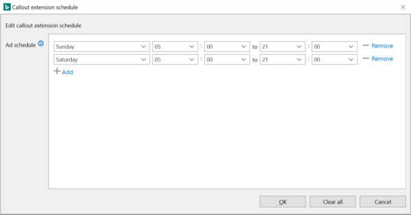
Ad extension scheduling
Advertisers can control when their ad extensions are shown in Editor, including by date, day of the week and time of day. There’s also support for times to be based on either the advertiser’s time zone or the searcher’s time zone.
These scheduling options allow advertisers to run ad extensions only during appropriate times and help enhance relevance. For example, a restaurant may want to have callout extensions enabled for the morning to highlight breakfast items, and then schedule them to turn off when breakfast stops serving and turn on callouts for dinner promotion.
The new scheduling options displayed when extensions are highlighted in Editor:

Clicking Edit in the Ad Schedule section of the editing pane brings up a scheduling window:
Shared Library support for call and location extensions
New Amazon Echo Speaker Unveiled With Late October UK Release Date
check out this post on New Amazon Echo Speaker Unveiled With Late October UK Release Date
Amazon has unveiled not one, but three brand-new Echo devices at a special event held at its HQ in Seattle.
The three new gadgets are the new Amazon Echo now at a lower price, the Smart home-controlling Echo Plus and a small quirky Echo Spot which contains a small circular display.
Leading the event is the brand-new Amazon Echo. This sequel to the popular voice-activated speaker now comes with a new design, improved audio and a cheaper price.
Amazon
According to Amazon the new Echo boasts improved sound quality over the original with sound processing by Dolby. It also comes with Amazon’s second generation far-field microphone technology which should make it even easier to talk to in big or noisy rooms.
Then of course there’s the design. Amazon’s taken a leaf out of Google’s book and like the Google Home, now offers the Echo with a range of different covers.
Amazon
It costs £89.99, is available to order now and will be released in the UK on the 31 October 2017.
Next up is the Echo Plus. This features the same design as the original Echo but comes with two major improvements.
Amazon
Firstly, it now has the same audio improvements as the Echo including both a dedicated tweeter and woofer and audio processing by Dolby.
The second feature is arguably the more exciting. Echo Plus is actually a smart home hub, which means that it is compatible with hundreds of smart home products straight out of the box.
You simply tell Echo Plus to discover what’s in your house and it will search for, and then connect to everything that’s compatible without you having to go through each individual product.
For the added convenience and slightly bigger audio Amazon’s charging £139.99 for the Echo Plus and it too will release in the UK on the 31 October.
Last but not least is the Echo Spot. This doesn’t have a UK release date but it’s sure to be a hit in the US.
Amazon
It’s essentially a tiny version of Amazon’s larger Show speaker, with a small circular display that can show information, requests. It also has a camera that means it can double as a nursery camera.
Finally Amazon announced that the Echo Show would be launching in the UK on the 16 November for £199.99.
Amazon
Bug drops Sitelinks Searchbox from Google search results

How LucidChart Used Kissmetrics to Drive Growth
this is a note on How LucidChart Used Kissmetrics to Drive Growth.
Be sure to digest the entire essay and view the main source

LucidChart, a SaaS-based diagramming application with over 9 million users, wanted to make sure their site was more than just pretty to look at. They wanted to ensure that it was leading users down the path to purchase. This is how they used Kissmetrics to leverage the behavioral data their users were leaving behind and increased conversions by 30%.
The initial step LucidChart took was to dive deep into data to better understand and evaluate the customer journey across their site. They learned what users were doing, where they were going and where they were dropping off across their site. Using insights from Kissmetrics they found key areas in the journey where they could drive efficiency and which pages they wanted to test a redesign.
After creating the new pages LucidChart used the Kissmetrics Funnel Report in correlation with the A/B Test Report to determine the effectiveness variation of the new pages both as a stand alone and part of the customer journey. Until they locked in on the best performing pages and process to drive conversions.
Funnel Report
Growth and marketing teams use our Funnel Report to see where dropoffs occur before conversion. This report is entirely customizable and can be used to track any conversion path you’d like. Furthermore, you can segment the data based on lead source, location, referring links, etc.
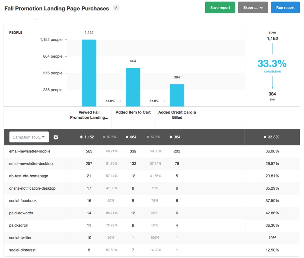
Used for illustration purposes. This is not LucidChart’s data.
LucidChart was able to track different segments across the customer journey and compare one another as well as use the A/B Test report to test the new design against the old.
A/B Test Report
With this report, you’ll create your test in an A/B testing tool, such as Optimizely, and track the results in Kissmetrics.

All data is imported from A/B testing tool and stored in Kissmetrics. Note: this is not LucidChart’s data.
What makes this Kissmetrics report unique is that you’ll be able to see how a test impacts any part of your funnel. Want to see if a new headline on your homepage leads to more purchases? Or see how a test in the middle of the funnel impacts the bottom line? Get your answer in just a few clicks in Kissmetrics. Having both reports coordinated in the same tool allowed LucidChart to measure the effectiveness of the new pages’ impact on the customer funnel with the old pages.
The Results
The outcome? By combining the power of the Kissmetrics A/B Test Report with the Funnel Report, LucidChart discovered that 2 pages in particular, their new homepage and new product page, were driving a huge 30% increase in conversions.
“Insights from Kissmetrics drove a 30% lift in our conversions. All of our key customer behavior data lives in Kissmetrics, for both our product and website, so we can quickly identify and take action on any roadblocks across our growth cycle. Kissmetrics is essential to Lucid Software’s growth efforts.”
Spencer Mann, VP of Growth at Lucid Software
Every time a prospect visits your site or uses your product they’re leaving a digital trail of their behavior – showing what they’re doing, where they get stuck, what they like, don’t like and why. There’s tremendous value in that data and it’s critical for driving growth.
Kissmetrics enables you to capture and leverage all that behavioral data to increase conversions, acquisitions and retention.